Redesign tablet app to allow sales people to access documents in the field
Team: Front End Developer, Program Manager
Role: Lead Senior Product Designer
Skills: Project scope, creative ingenuity, task and problem analysis, design thinking, gather requirements, wire frames, user flow, interaction design, mock-ups, presentation, prototyper
Tools: Pen, Paper, Illustrator, Figma, Photoshop, HTML, CSS, JavaScript
DISCOVERY
THE PROBLEM
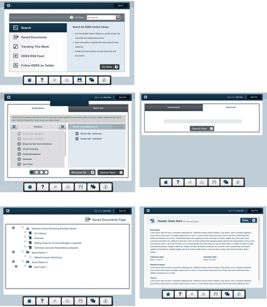
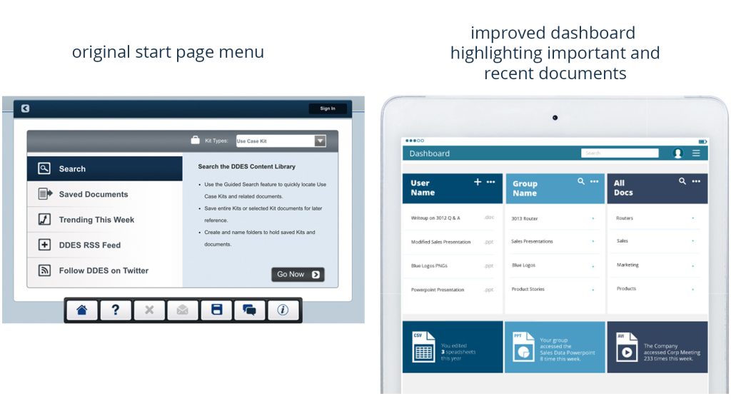
The product below was not designed around the user’s concerns and motivations: finding documents quickly, adding documents easily, and presenting the most pertinent documents first.
ORIGINAL PRODUCT

CORE QUESTIONS
What documents do users access the most?
How do we get users to include new documents?
Do we need a tablet app or a website?
What is the first thing users should see?
How do we make the experience easier?
How do we make the experience better?
How do we simplify search?
How do we keep users informed about the current state of documentation?
How do we inform users about new documents they might find interesting?
How do we prompt users to add their own documentation?
USER WANTS
Point me to the documentation that most interests me first
Make it easy to find the newest documentation
Keep me up to date with pertinent company events and important documents
Make it easy to keep up with my group
Make it easy to access documents while in the field
IDEATION
USER PERSONAS
Uses the app to keep team up to date with published documentation.
Uses the app to access new documentation for sales calls.
Uses the app to keep up with company events.
PRECONCEIVED SCREENS REQUIREMENTS
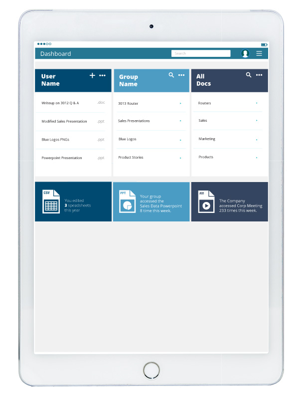
Screen 1 – Intro Search screen converted to dashboard
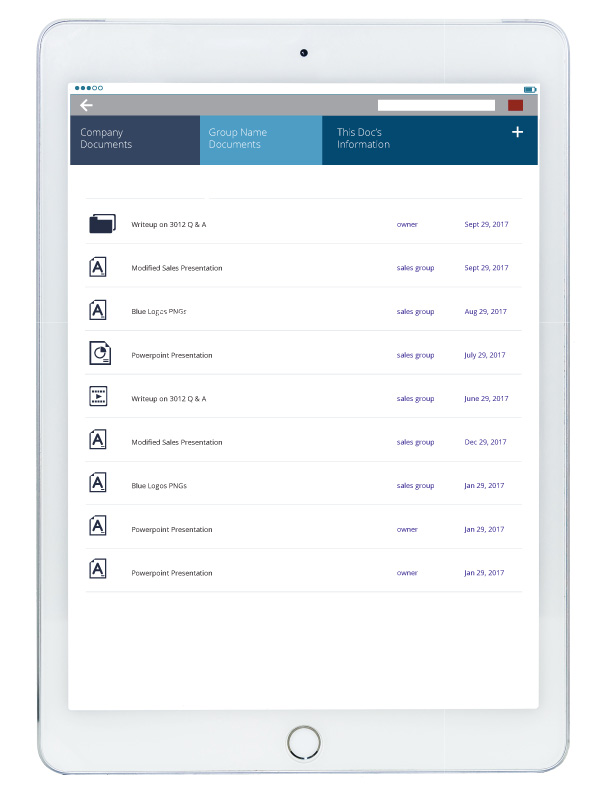
Screen 2 – Personal Documents
Screen 3 – Group Documents
Screen 4 – Company Documents
Screen 5 – Documents Details
LOGIC FLOW


LOW FIDELITY MOCKUPS

HIGH FIDELITY MOCKUPS


DESIGN PROBLEMS AND SOLUTIONS
PROBLEM: SEARCH IS NOT INTUITIVE
Search in the original product was only available from a dedicated “search” screen. New or important documentation was highlighted from a different screen. In the updated version a simple textbox search is available on every screen. The search assumes that the first results shown should be contextualized to the current screen. For instance, if the user is looking at the “group documents” screen then documents from the group should show before documents from unrelated groups.

PROBLEM: DIFFICULT TO ORGANIZE DOCUMENTS
The documents in the original product were organized with a tree structure and individual user documents were stored in personal “suitcases”. The tree was difficult to search and navigate. The tree structure was replaced and simplified with a folder structure in which the suitcase was just a folder owned by the end user. This is a more common paradigm used by Google Drive and Microsoft Cloud.

PROBLEM: USERS ARE NOT ADDING THEIR OWN DOCUMENTS EVEN THOUGH IT IS PART OF THEIR JOB.
The new dashboard keeps track of how many new documents have been created/added by the user and the documents are visible with each log in.
