The combination of Object-Oriented User Experience (OOUX), LUMA forms a comprehensive system for addressing, delivering, and maintaining complex and competing requirements in the design and development process.
Completed Project : Figma | Coded Interface
Project Review:
This is a short review of the following project that successfully mixed complicated UX engineering needs with design aspects of UX and UI. I would be more than happy to demonstrate any part of this project. I can provide Figma, and the finished application.
This page is a synopsis of a much larger document that includes detailed information about managing the synchronizing of LUMA UX, OOUX, React and React Material UI. The paper in it’s entirety can be downloaded below.
Role: Michael Long (UX Delivery Associate Director, Design Director)
The Issue: Previous software solutions have displayed a lack of professional rigor, falling short of meeting intricate universal requisites, and demonstrating suboptimal performance.
- The development process is unable to faithfully implement or construct the original designs
- The resulting products lack accessibility, hindering their usability
- The progress of development is impeded by the burdensome need to create individualized versions for both mobile and desktop platforms
- The software solutions are not compatible with older browsers, limiting their accessibility across diverse user groups
- The performance of the software products is impaired due to an accumulation of unplanned patches and workarounds during the development phase
- Despite being developed on robust, professional frameworks like React Material UI and React Bootstrap, which are designed to accommodate complex requirements such as accessibility and responsiveness, these essential features are conspicuously
- Product language localization is not considered until the final stages of development where it creates considerable issues
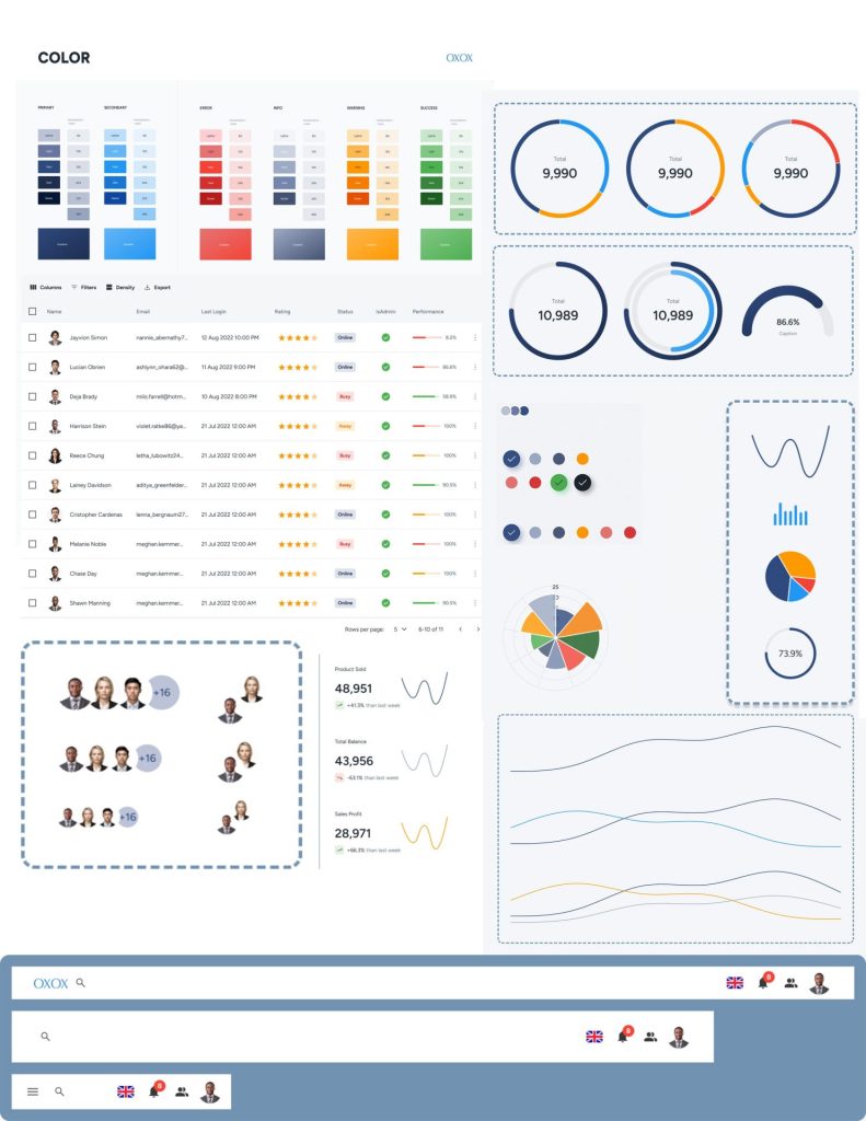
Strategy Statement: Our suggested plan for a smooth design and development process involves providing designers with a toolkit in Figma. This toolkit mirrors our company’s Material UI design style (colors, typography, etc), components, and charts, complete with component states and requirements. This strategy meets Material UI’s high standards and makes sure every component is accessible and responsive.
By giving designers a set of Figma components that strictly follow these guidelines, we can shape our product more effectively. This method ensures we stick to the Material UI framework and meet all user experience needs. In the past, designers have created “design systems” without considering the technology underneath. But when we tried to get these “design systems” up and running, we encountered bugs, failed to meet accessibility needs, and ended up with a less professional product.
Requirements for the application
- Mobile
- Accessibility
- Responsive
- Old Browser Support (Polyfils)
- Language Localization
- IOs and Android ()Support
- Brand Styles
- Component States already exist
- Component’s already support all states shown in design (important for tables)
UI : Synchronizing Design and Development with a Theme
We are starting with the corporate look and feel. We need to create a theme for our React Material UI library. Our goal is to work with development so that we can have a completed Material UI theme IN CODE based on the following design theme.
Components Created from Material UI in Code

Components in Figma

UX : Building from your UI theme
Armed with a strong design library in both code and Figma, which matches the brand, covers a wide range of needs, and syncs with coded Material UI components, we’re ready to go. Because our Figma designs are based on coded Material UI parts, we know our design system can handle complex needs.
Why OOUX Leads to Better UX
Think about all the unique and often conflicting requirements each design change involves. Starting with a coded Material UI theme mirrored in Figma and then designing an application using these pre-coded Figma parts, makes the process much quicker and simpler.
How OOUX Simplifies the Designer’s Job
OOUX makes the designer’s job easier by letting them concentrate more on the end-user and unique features that will make the product stand out. Basic components and proven design patterns, like login processes or simple user settings, are already well-tested and outlined.
In our trucker app, special features like our AI chatbot mechanic, clear display of the truck’s status, and a direct link to the mechanic are what will make our app special. These unique features, along with the efficient design processes OOUX provides, will make our app not only practical but also easy to use and competitive in the market.


Focusing Designers on User Needs and Workflows:
This OOUX approach enables designers to concentrate on user needs and workflows rather than recreating standardized components like buttons, form fields, tables, and established design patterns.
Streamlining the Process for Developers:
Because the design is closely integrated with the development, developers can efficiently build, modify, and maintain our application. This synchronization frees up time to focus on critical features. In the context of our trucker application, most engineering effort will be dedicated to the AI chatbot and the real-time status of the truck and load.

At the start, our main goal is to set a clear direction and lay the foundation for the app. It’s important to build momentum and move towards a working prototype quickly, instead of getting stuck in research or analysis (analysis paralysis). As the prototype develops, we’ll identify where we might need to do more LUMA exercises. These exercises are often more useful if they’re done throughout the prototype development, rather than just at the start. At the beginning of the development process, we put a lot of effort into the UI to speed up the creation of the prototype.
